Oisin’s Honey – Visual Identity & Packaging Design
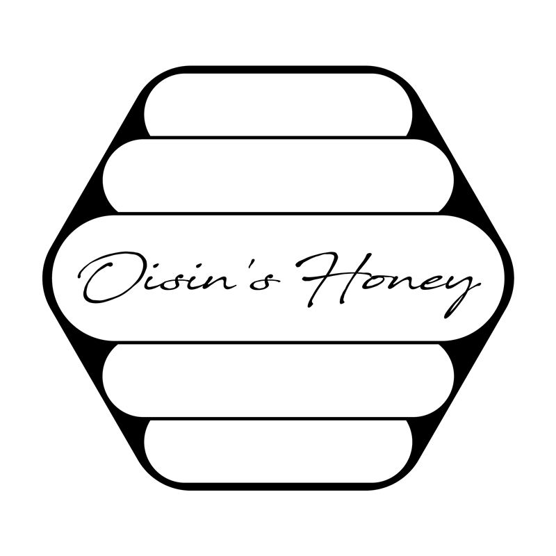
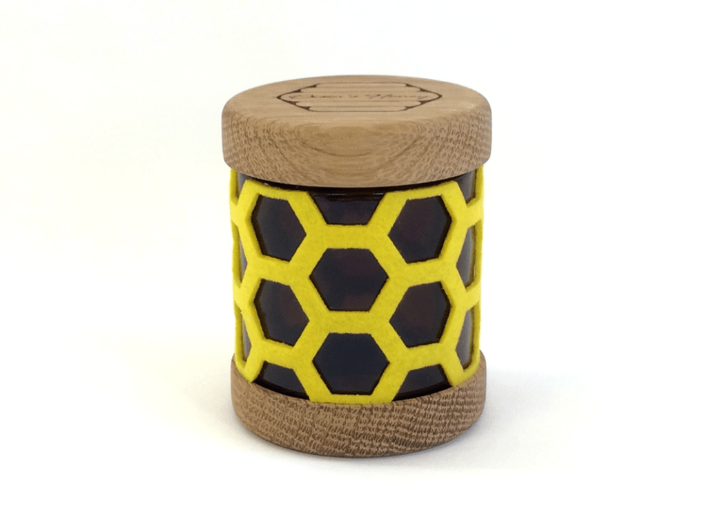
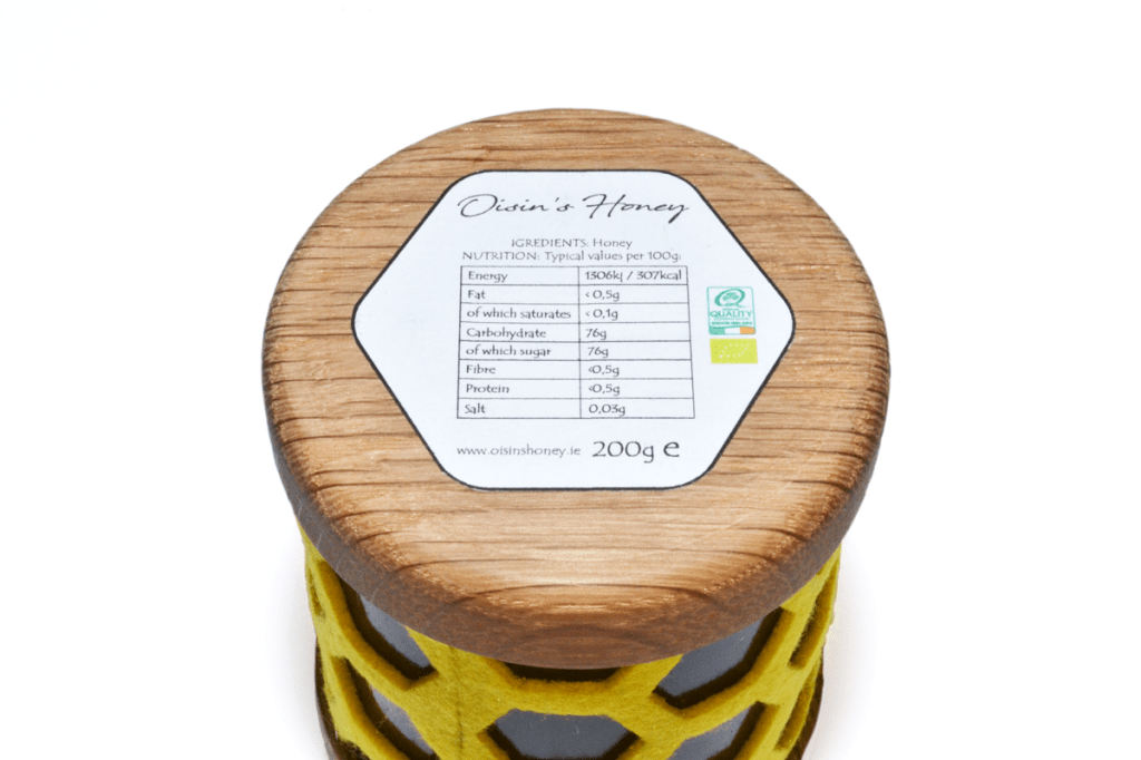
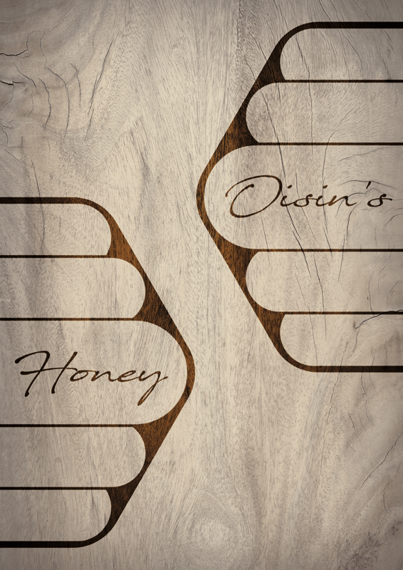
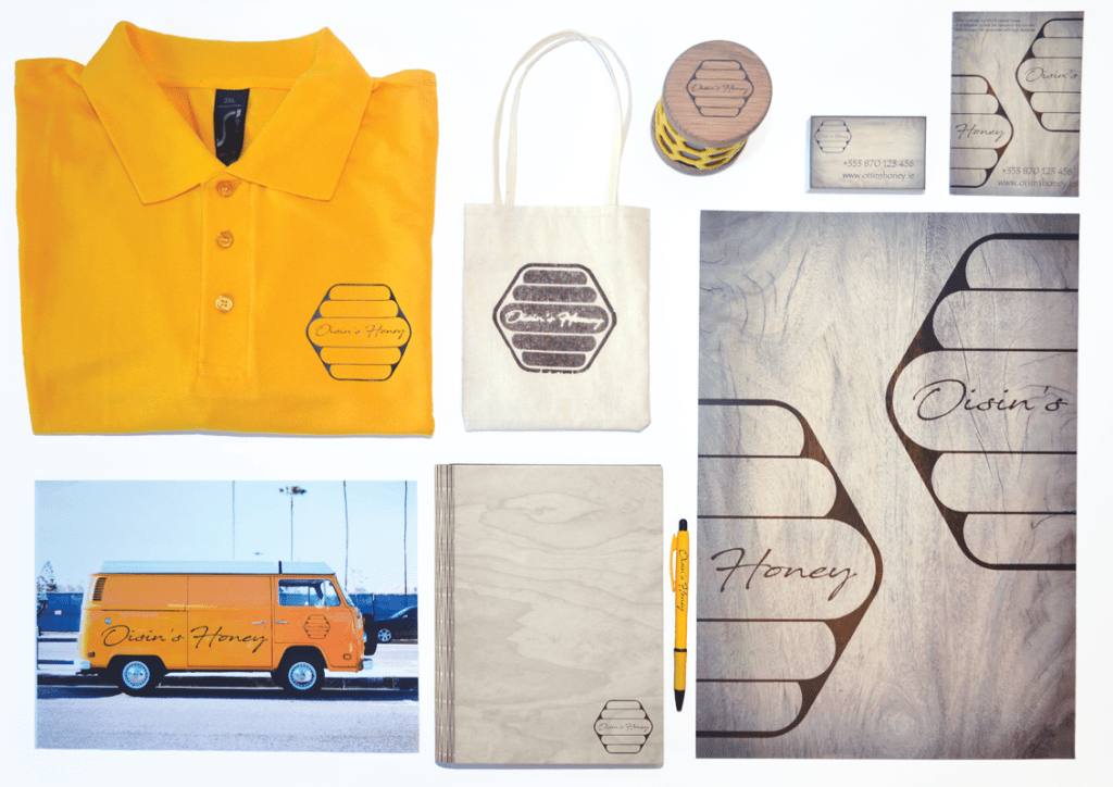
The Oisin’s Honey identity draws directly from the geometry and craft of beekeeping, transforming the hexagon — a natural architectural symbol — into the core of the brand. The logo’s layered hive-like structure conveys purity, order, and the organic efficiency of bees, while the handwritten script introduces a personal, artisanal character. The packaging continues this narrative through a tactile hexagonal lattice wrapped around the jar, visually referencing honeycomb and celebrating the product’s natural origin. Wooden top and bottom elements reinforce themes of sustainability and traditional craftsmanship, elevating the honey from everyday food item to a premium, gift-worthy product. The restrained black-and-white logo paired with vibrant honey-yellow packaging creates a strong balance between elegance and warmth. Together, the identity and container design articulate a story of authenticity, local care, and the deep connection between bees, craft, and nature.